From Rotting Page to Living Portfolio: Rebuilding with a Decade of Experiments
This redesign was not a greenfield project. It started with something far more dangerous: a portfolio page that had been quietly decaying for nearly a decade.
Over those years, most of the real growth happened elsewhere — in side projects, prototypes, game tools, visualization experiments, and increasingly deep dives into modern JavaScript and WebGL. The portfolio itself became a fossil: technically outdated, visually bland, and completely disconnected from what I can actually build today.
Why it rotted in the first place
Old portfolios fail for a simple reason: they represent a snapshot in time, while skills evolve continuously. Once the gap becomes large enough, updating the page feels harder than ignoring it.
Meanwhile, the real learning happened in places that were never meant for recruiters:
- JavaScript architecture experiments
- Canvas and WebGL rendering prototypes
- Interactive UI concepts
- Tooling for games and pipelines
- AI‑assisted workflows
None of that knowledge was visible on the old site.
Applying experiment skills to a “serious” artifact
The redesign deliberately reuses patterns proven in those experiments — but translated into a professional context. No flashy tech demo for its own sake, only elements that improve communication, navigation, or clarity.
Modern JavaScript without framework lock‑in
Years of building small tools led to a preference for lightweight, dependency‑free code. The portfolio follows the same philosophy: modern ES features, modular structure, but no heavy framework that would complicate hosting or long‑term maintenance.
WebGL thinking applied to UI
Even where WebGL itself is not visible, its mindset influences the design: everything is treated as a system with performance constraints, state, and interaction flow. Motion is purposeful, not decorative. Visual elements communicate information density rather than raw spectacle.
The structural overhaul
The old site was page‑based and fragmented. The new version is a cohesive single‑page experience that mirrors how people actually evaluate candidates: quick scan first, deep dive second.
- Hero — identity and positioning
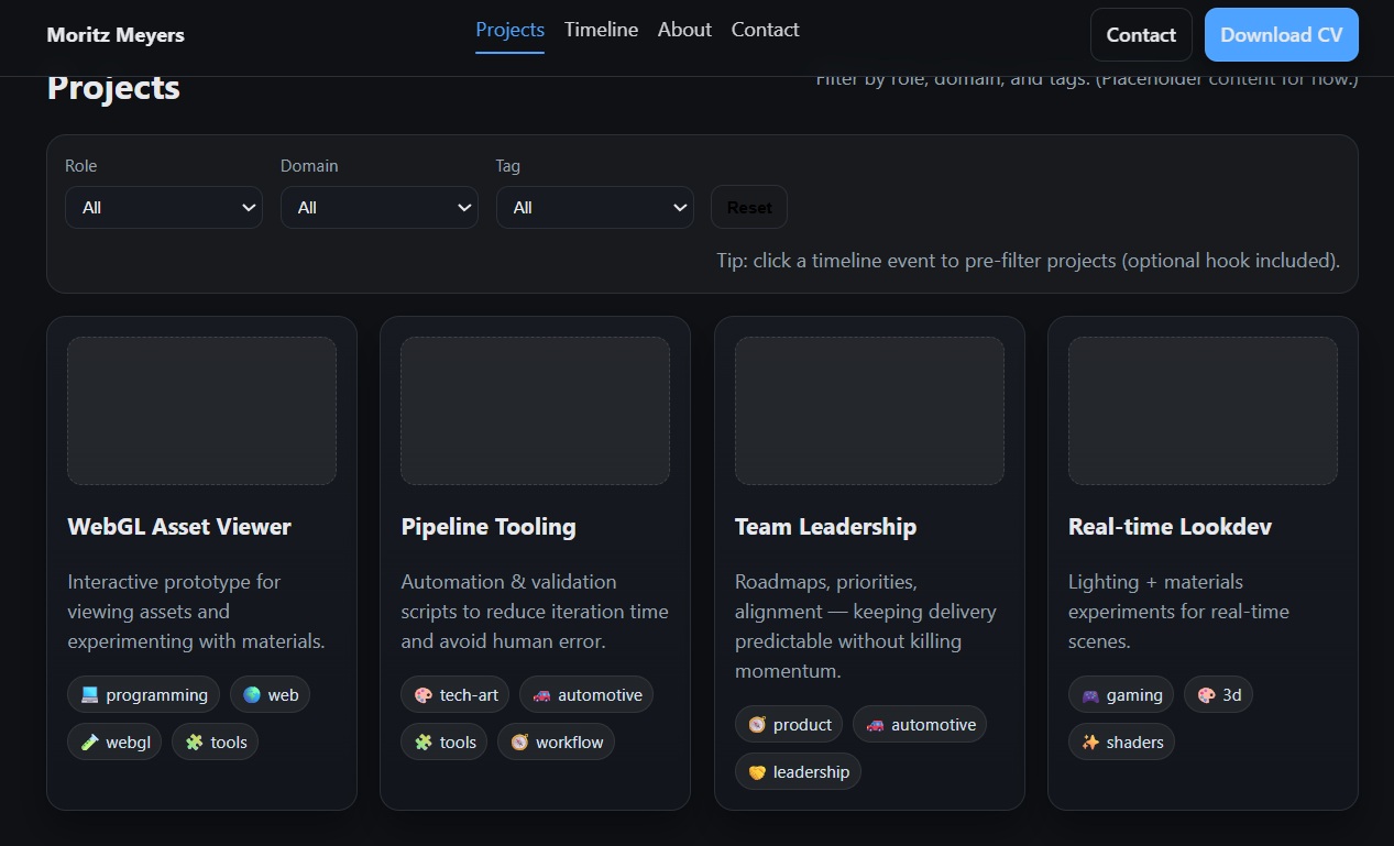
- Projects — concrete proof of work
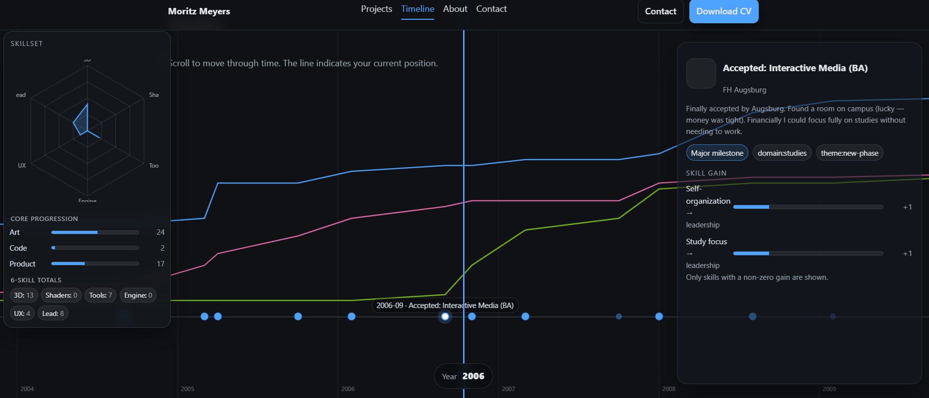
- Timeline — evolution of skills
- About — context without autobiography
- Contact — zero friction
The timeline as a synthesis of everything learned
The horizontal scrollytelling timeline is where most experimental knowledge converges. It combines interaction design, performance considerations, data visualization, and narrative structure into one component.
Instead of listing jobs chronologically, it shows how capabilities accumulated and shifted over time — a far more accurate representation of a hybrid technical profile.
Content refresh: replacing placeholders with reality
A redesign without content updates would just produce a prettier lie. Every section was rewritten to reflect current responsibilities, shipped work, and actual strengths rather than aspirational buzzwords from years ago.
What changed the most
- From static pages → interactive narrative
- From skill lists → demonstrated capability
- From generic CV clone → domain‑specific identity
- From “safe” design → intentional design
Few hours in: current project status
After a few focused hours of work, the project already feels more alive. The current WIP state highlights useful features that can also be integrated into the portfolio tracker, especially the timeline flow and the hexagon display logic.
Click image to enlarge ↗
Click image to enlarge ↗
The blog itself keeps becoming a learning loop: each post captures experiments, those experiments feed the next build, and the cycle continues.
Why this matters
A portfolio is not just a showcase — it is itself a product. Leaving it untouched while skills advance is like shipping updates without ever releasing them.
This rebuild closes that gap. It takes the accumulated results of countless small experiments and consolidates them into a single artifact that recruiters, collaborators, and teams can actually evaluate.